Why Shigurui Manga Panels Hit So Hard
Before getting into technical details, it helps to understand why Shigurui’s art strikes so forcefully — because it’s not just about skill. It’s about purpose.
The very first pages of Volume 1 show two maimed warriors standing across from each other in a tournament arena. One is blind. The other is missing his left arm. Neither man’s face shows fear. The reader has no idea how they arrived at this moment, and that visual mystery — two destroyed men about to kill each other — drives the entire narrative.
Every panel in Shigurui serves the story’s central question: what did the sword do to these people? Yamaguchi doesn’t draw violence for spectacle. He draws it as consequence. When a body is cut, you see exactly how the muscle separates, how the bone resists, how the blood falls. When a character goes mad from years of brutal training, you see it happening in the slow degradation of their face across dozens of chapters.
The tournament decree — Tokugawa Tadanaga ordering real swords — gives the entire manga its political and emotional weight. The panels convey that this isn’t just combat. It’s a sadistic spectacle orchestrated by a man with absolute power, and every swordsman on that floor is expendable. Yamaguchi makes you feel that expendability in how he composes the arena scenes: small human figures dwarfed by wooden architecture, watched by rows of silent, powerful men.
Anatomical Horror Precision
Yamaguchi studied human anatomy to a degree that’s unusual even among manga artists working for adult audiences. His bodies aren’t idealized or exaggerated — they’re accurate, and that accuracy is what makes the violence so disturbing.
- Muscle definition follows real anatomy. When a character tenses before a strike, you can identify specific muscle groups engaging. When a blade cuts through flesh, the layers — skin, fat, muscle, bone — are rendered distinctly. This is a commitment to showing what a sword actually does to a human body.
- Bodies show the effects of training. Swordsmen in Shigurui have overdeveloped forearms, callused hands, and postures shaped by years of specific practice. Yamaguchi draws different body types for different fighting styles, and those differences matter in combat scenes.
- Injuries are drawn with medical precision. A severed tendon doesn’t just bleed — you can see which tendon it is and understand why the character can no longer grip their sword. A facial wound heals across chapters with realistic scar tissue. This attention to physical consequence grounds the manga in a reality that makes every fight feel genuinely dangerous.
- The female body is drawn with the same unflinching detail. Female characters aren’t softened or prettified to contrast with the violence. They exist in the same brutal world, and their bodies show it.
The closest comparison in manga is the anatomical work in Berserk by Kentaro Miura, but where Miura often exaggerated musculature for dramatic effect, Yamaguchi stays closer to realism. His bodies look like they could belong to real Edo-period swordsmen — powerful but human-scaled.
Combat Choreography in Panels
Sword fights in most manga rely on speed lines (radiating lines drawn around moving objects to convey motion), dramatic poses, and impact frames. Shigurui does something different: it breaks combat down into phases, showing each stage of a technique with the clarity of a training manual.
- The preparation. Before a strike, Yamaguchi often devotes one or more panels to the stance. You see the weight distribution, the grip angle, the position of the rear foot. For readers familiar with kenjutsu (the Japanese martial art of swordsmanship), these stances are recognizable. For everyone else, they communicate something equally important: this character is thinking before they move.
- The execution. The strike itself is typically shown in a single decisive panel, often wider than the preparatory ones. Yamaguchi uses clean, confident lines during the actual cut. The blade’s path is implied by the body’s motion rather than drawn as a separate effect.
- The result. And then the aftermath. This is where Shigurui is most distinctive. The panel after a strike shows exactly what happened to the body that received it. There’s no cutaway, no tasteful shadow. Yamaguchi holds the camera on the damage because the damage is the point.
- Multiple-page sequences. Some fights stretch across many pages with very little dialogue. The panels alone tell you who is winning, who is desperate, and who has already given up. Yamaguchi trusts his art to carry narrative weight without words.
The pacing of combat in Shigurui is deliberately slow. A single exchange that would take two seconds in real time might occupy four or five pages. This isn’t padding — it’s the manga’s way of saying that every fraction of a sword fight is life or death.
Psychological Horror Through Faces
The violence in Shigurui is brutal, but the faces might be even more disturbing. Yamaguchi uses extreme close-ups of eyes, clenched jaws, and subtle facial distortions to convey the psychological toll of living inside a sword school that treats human beings as disposable.
Master Iwamoto Kogan is the most striking example. When he first appears, Kogan’s face radiates authority — sharp eyes, strong jaw. As the story progresses and dementia consumes him, his face changes. The jaw slackens. The eyes lose focus. Yamaguchi draws this deterioration gradually across volumes, so it sneaks up on you the way dementia sneaks up on a family. One day you look at a panel of Kogan and realize this is no longer the same man.
Irako Seigen, the manga’s other central figure, receives equally detailed facial treatment. His expressions cycle through arrogance, agony, and blind determination. Arrogant Irako has hooded eyes and a slight smirk. Suffering Irako’s face contorts in ways that look genuinely painful to draw. After his blinding, his expressions become eerily calm — a flatness that tells you something fundamental has been destroyed inside him.
And then there are the dead stare panels — moments where a character’s eyes go completely flat. No light reflection, no emotion, just emptiness. These panels signal the dehumanizing effect of the Kogan-ryū (the name of the sword school, “ryū” meaning a school or style of martial arts) culture, where students are trained to suppress every human impulse until they become weapons.
Panel Layout and Page Composition
Yamaguchi’s page architecture is as deliberate as his anatomy. He uses layout itself as a storytelling tool, manipulating how you read a page to control what you feel.
- Irregular panel shapes during violence. When combat erupts, the clean rectangular panels give way to jagged, angular shapes that break the reading rhythm. Your eye doesn’t flow smoothly — it stumbles, jerks, accelerates. The layout itself becomes disorienting, mirroring the chaos of a sword fight.
- Wide cinematic panels for establishing shots. Landscapes, castle exteriors, and wide views of the tournament grounds get panoramic horizontal panels that slow the reader down and create a sense of scale.
- Claustrophobic tight panels for dojo interiors. When the action moves inside, the panels compress. Characters are crammed into narrow frames, hemmed in by wooden walls and paper screens. The layout makes you feel the physical confinement of the dojo.
- Splash pages used sparingly. A splash page is a single image that fills an entire page. Yamaguchi conditions the reader with dense, multi-panel pages for the majority of the manga. Because of this, when a full-page splash appears, the impact is enormous. He earns every splash page by making them rare.
- Visual silence. Some of the most powerful pages in Shigurui contain no dialogue at all. Entire sequences play out through images alone — a character walking through a garden, a hand gripping a scabbard, rain falling on wooden steps.
Shigurui, Berserk, and Vagabond: A Quick Comparison
Readers often mention Shigurui manga panels in the same breath as two other series known for extraordinary art:
| Shigurui | Berserk | Vagabond | |
|---|---|---|---|
| Artist | Takayuki Yamaguchi | Kentaro Miura | Takehiko Inoue |
| Setting | Edo-period Japan (1629) | Dark fantasy medieval Europe | Early 1600s Japan |
| Art style | Hyper-realistic anatomy, restrained linework | Dense cross-hatching (layered parallel lines creating shadow and texture), gothic detail | Ink wash, brushwork |
| Violence | Clinical, precise, unflinching | Spectacular, apocalyptic | Grounded, weighted |
| Page layouts | Irregular and disorienting during combat | Dense with intricate splash pages | Flowing, painterly |
| Emotional register | Cold, suffocating, psychologically oppressive | Epic, tragic, furious | Contemplative, spiritual |
All three represent peaks of manga artistry, but they feel nothing alike to read. Berserk overwhelms you. Vagabond invites reflection. Shigurui makes you hold your breath and forget to exhale.
Nature, Architecture, and Environmental Detail
Yamaguchi doesn’t just draw people well — he draws places well, and those places do real narrative work.
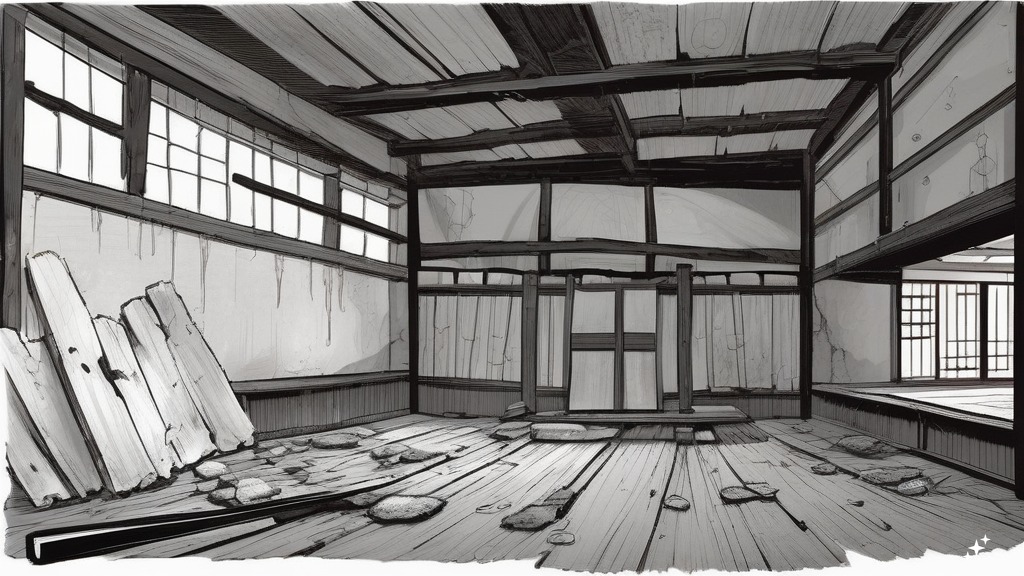
Edo-period architecture is rendered with historical care. The wooden floors of the dojo show grain. Paper screens (shōji, the sliding translucent panels found in traditional Japanese buildings) are translucent in some panels, opaque in others, depending on the light source. Roof tiles, gate posts, castle walls — everything is drawn with enough detail to ground the reader in a specific time and place.
Weapons and clothing receive the same treatment. Katana blades show subtle curvature differences between individual swords. Hakama (the wide, trouser-like garments worn over a kimono in traditional Japanese dress) fold realistically around legs in motion. Armor ties and lacings are accurate to the period.
Nature panels serve as emotional counterpoints to the violence. Cherry blossoms appear during moments of beauty that are about to be destroyed. Rain falls during scenes of despair. Moonlight illuminates acts of cruelty with a cold, indifferent glow.
The dojo is the most important recurring environment. Early in the story, the dojo is clean, orderly, and lit with warm natural light. As the school descends into madness and power struggles, the same space becomes darker, messier, more oppressive. Wooden floors that were once pristine show stains. Shadows deepen. The architecture hasn’t changed, but the way Yamaguchi draws it has, and that shift tells you everything about what’s happening to the people who live there.
Key Scenes Worth Knowing About
Volume numbers below refer to the Japanese collected volumes published by Akita Shoten (15 volumes total, 2003–2010). No English editions exist.
Volume 1: The Tournament Opening
The image that hooks most readers. Two maimed warriors — Fujiki Gennosuke (missing his left arm) and Irako Seigen (blind) — face each other in the arena. The opening pages establish the central mystery and showcase Yamaguchi’s ability to make stillness feel violent. The characters aren’t moving yet. They’re just standing there. And it’s one of the most tense openings in manga.
Volumes 2–4: The Training Sequences
The story shifts to flashback, showing how both men came to the Kogan-ryū sword school. These volumes contain the brutal disciplinary culture of the dojo — training methods that border on torture, hierarchy enforced through pain. The claustrophobic panel layouts make you feel trapped alongside the students.
Volumes 5–7: Irako’s Rise and Fall
Irako’s ambition, his challenge to the school’s hierarchy, and the horrifying consequences. These volumes contain the scenes that lead to his blinding — some of the most disturbing panels in the entire manga. The 12-episode anime adaptation (Shigurui: Death Frenzy, 2007, produced by animation studio Madhouse) covers roughly this far into the story.
Volumes 8–15: Beyond the Anime
The anime ends without resolution after Volume 7’s material. The manga continues into an extended aftermath, revenge, and final confrontation. Yamaguchi’s art matures noticeably in these later volumes — the linework becomes more confident, the page layouts more experimental. The final battle pays off 15 volumes of buildup with visual storytelling precise enough that you could follow the fight with all dialogue removed.
Shigurui Panels vs. the Anime Adaptation
The anime — Shigurui: Death Frenzy — aired in 2007, running 12 episodes. It covers roughly the first 7 volumes.
What the anime does well
The adaptation captures Shigurui’s atmosphere effectively. The color palette is muted earth tones that match the manga’s oppressive mood. The pacing is deliberately slow, respecting the source material’s refusal to rush.
What only the manga delivers
- Linework detail. Yamaguchi’s individual lines — the cross-hatching on skin, the texture of wood grain, the precise rendering of steel — are lost in animation’s smoothed-out aesthetic. The manga rewards close examination of individual panels in a way that moving images can’t.
- The complete story. The anime covers roughly half the manga and ends without resolution. Volumes 8–15 contain the actual climax and resolution of every major character storyline.
- Page composition as storytelling. The manga’s panel layouts — the irregular shapes, the visual silence, the deliberate pacing of splash pages — are a storytelling tool that doesn’t translate to screen.
For anime-first readers
If you came to Shigurui through the anime and want to continue, pick up from Volume 7 or 8 of the Japanese collected editions. That said, rereading from Volume 1 is worth it — seeing Yamaguchi’s original linework after the anime adds a new layer of appreciation.
How to Read Shigurui (And What to Read Instead)
Content warnings
This is not a soft entry point into manga. Shigurui contains extreme graphic violence (detailed depictions of dismemberment, torture, and death), sexual violence, and psychological abuse. This is one of the most brutal manga ever published. The art is stunning because it refuses to look away, not despite it. Know what you’re getting into.
Reading pace
Shigurui rewards slow reading. Rushing through panels means missing the subtle facial changes, the environmental storytelling, the anatomical precision that makes the violence meaningful. Give each page the time it’s asking for. Look at the backgrounds. Study the hands. This is a manga that reveals more on second and third readings.
If the art interests you but the content is too extreme — or you want something you can buy in English
Since Shigurui has no English release, here are series with similarly remarkable artwork that you can own:
- Vagabond by Takehiko Inoue — A samurai manga with breathtaking brushwork, grounded in the life of legendary swordsman Miyamoto Musashi. The violence is present but less clinical than Shigurui. The VIZBIG editions (VIZ Media’s oversized collected format) present the art at a generous size that lets you appreciate every brushstroke.
Vagabond Vol. 4 (VIZBIG Edition)
Vagabond Vol. 4 (VIZBIG Edition)
- Blade of the Immortal by Hiroaki Samura — Another Edo-period samurai manga with extraordinary linework and creative page layouts. It’s violent, but the tone is more adventurous than Shigurui’s suffocating atmosphere.
Blade of the Immortal Deluxe Volume 1
Blade of the Immortal Deluxe Volume 1
- Berserk by Kentaro Miura — Also extremely violent and graphic, so this isn’t a “lighter” alternative. But if Shigurui’s art amazes you, Berserk is the other manga most often cited alongside it for sheer artistic achievement. The Deluxe Editions present Miura’s art at oversized dimensions.
Berserk Deluxe Volume 5
Berserk Deluxe Volume 5
- Planetes Deluxe Edition by Makoto Yukimura — Not a samurai manga, but a science fiction series with beautiful, precise artwork. If what draws you to Shigurui is the draftsmanship rather than the subject matter, Planetes showcases similar technical care in a completely different setting.
Planetes Deluxe Edition Book 1
—
Shigurui manga panels aren’t just beautiful. They’re honest — honest about what swords do to bodies, what power does to people, and what obsession does to the human face. That honesty is what makes Takayuki Yamaguchi’s art stay with you long after you close the book.
Whether you’re here because a single panel stopped you mid-scroll, or because you’ve read every volume and want to understand why the art works so well — you already know what makes Shigurui special. The art doesn’t need to convince you. It already did.