What Makes Nihei Manga Art Unique
Before diving into individual works, it helps to understand what makes a Nihei page look like a Nihei page. His art rests on a few core pillars that show up across his entire career, even as his tools and techniques changed.
Architectural Scale That Dwarfs Everything
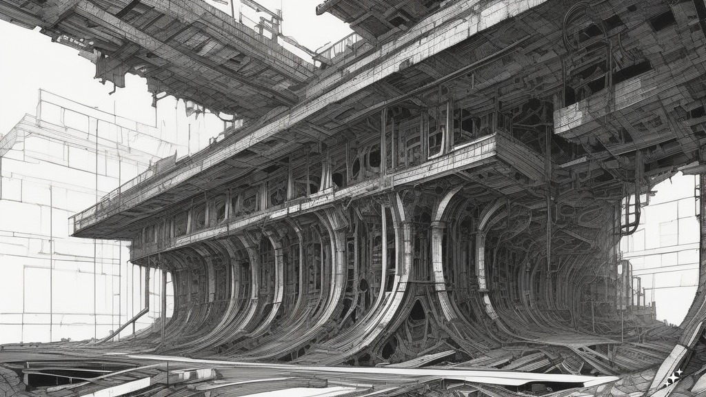
This is the big one — literally. Nihei studied architecture and worked at a construction company before becoming a mangaka, and that background bleeds through every panel (the individual framed images that make up a manga page) he draws. His environments aren’t backdrops. They’re characters.
In most manga, a building is a building. In Nihei’s work, structures extend beyond what the eye can process. Walls are layered with pipes, conduits, and mechanical details that suggest systems built on top of systems built on top of ruins. The spaces feel lived-in on an ancient, almost geological timescale — not designed for human comfort but for some unknowable industrial purpose that humanity long ago forgot.
This sense of scale does something powerful to the reader. When a character is drawn as a speck against a structure that fills an entire double-page spread (two facing pages treated as a single image), you don’t just see the size difference — you feel it. That smallness, that vulnerability, is baked into the art itself.
Dense Crosshatching and Ink Texture
Early Nihei — especially in BLAME! and Abara — uses heavy crosshatching (a drawing technique where intersecting sets of parallel lines are layered over each other to build up shadow, texture, and depth) that creates a gritty, oppressive atmosphere unlike almost anything else in manga. Surfaces feel corroded, ancient, layered. Every wall has a history written in ink scratches.
What’s remarkable is how much of this tonal work is done by hand with pen. Screentone — pre-made adhesive sheets with printed dot or line patterns that manga artists use to add shading — is used sparingly in his early works. The darkness, the depth, the sense of grime and weight all comes from Nihei’s hand moving across the page, building up layers of ink. It gives his art a tactile quality that’s almost sculptural. You can practically feel the rough metal surfaces under your fingers.
Minimal Dialogue, Maximum Visual Storytelling
BLAME! is famously sparse — the protagonist Killy barely speaks. But this isn’t laziness or lack of writing ability. It’s a deliberate artistic choice that puts enormous narrative weight on the visuals.
Nihei forces readers to parse environments, body language, and spatial relationships to understand what’s happening. Action sequences are told through movement lines and impact rather than narration or dialogue boxes. A fight scene might span several pages with zero text, relying entirely on how the panels are composed and how bodies move through space.
This makes his art carry narrative weight that dialogue-heavy manga delegates to text. When you read Nihei, you’re reading the art, not words accompanied by pictures. It’s a fundamentally different experience, and it’s a big part of why his work rewards re-reading — you catch visual details on your third pass that you missed entirely the first time.
Biomechanical Horror
Nihei’s creature and character designs owe a clear debt to biomechanical aesthetics in the tradition of H.R. Giger, the Swiss artist who designed the iconic creature from the Alien films. Bodies merge with machines. Organic tissue sprouts cables. Armor plating looks grown rather than manufactured.
This isn’t just cool design for its own sake — it serves the themes of his stories, which frequently explore what happens when the boundary between human and machine dissolves completely. The horror comes from the ambiguity: is that a person in a suit, or a machine that used to be a person?
How Nihei’s Art Evolved Across His Major Works
One of the most fascinating things about following Nihei’s career is watching his style transform. The raw, almost abrasive energy of his early work gradually gives way to cleaner, more accessible art — but the core DNA never disappears.
BLAME! (1997–2003) — Raw, Dense, Uncompromising
10 volumes (67 chapters); available as a 6-volume Master Edition (oversized hardcover format with larger pages) from Vertical/Kodansha USA, an English-language manga publisher
This is peak Nihei. The roughest linework, the densest environments, the most extreme sense of scale. Some pages are nearly abstract in their complexity — you stare at them and slowly realize you’re looking at a cityscape viewed from an impossible angle, or the interior of a structure so large it has its own horizon line.
BLAME! follows Killy as he wanders through an endlessly expanding megastructure called the City, searching for a human with Net Terminal Genes — a rare genetic trait that would allow someone to communicate with and control the City’s automated systems. The plot is deliberately obscure, told more through imagery than exposition. This is a feature, not a bug — the art IS the story in a way that’s true for very few other manga.
The Master Edition’s oversized hardcover format is genuinely the best way to appreciate this art. Standard-sized volumes compress details that were meant to breathe. When you see a full spread at the larger size, details emerge that were invisible before — tiny figures on distant platforms, structural elements that reveal the geometry of the space, textures that dissolve into noise at smaller scales.
If you care about manga as a visual art form, the BLAME! Master Edition belongs on your shelf. Open to any random spread and let your eyes wander.
NOiSE (2001) and Abara (2005–2006) — Experimental Extremes
NOiSE is a single-volume prequel to BLAME! that shares its raw, heavy ink style. It provides a bit more narrative context for the City’s origins, but visually it lives in the same territory — dense, dark, and unrelenting.
Abara (2 volumes, released by VIZ Media — another major English-language manga publisher — as a Complete Deluxe Edition in a single oversized book) pushes Nihei’s biomechanical design to its most grotesque extreme. The body horror here is intense. Characters undergo transformations that blur the line between flesh and architecture in ways that make even BLAME!’s imagery look restrained. If you’re specifically drawn to the biological/mechanical fusion aspect of Nihei’s art, Abara is where that impulse runs wildest.
Both of these are short enough to read in a single sitting, and they work as companion pieces to BLAME! — showing what happens when Nihei focuses that same visual intensity on slightly different subject matter.
Biomega (2004–2009) — Action Meets Architecture
6 volumes, published by VIZ Media
Biomega represents a fascinating middle point in Nihei’s evolution. The lines are slightly cleaner than BLAME! but retain heavy inking. The pacing is faster — this is an action manga with motorcycle chases through megacities, zombie-like infection outbreaks, and a bear named Kozlov who operates as a surprisingly effective character. (Yes, really. A bear. Nihei’s occasional dark humor in character design is one of his most endearing qualities.)
The art here serves speed and momentum in a way that BLAME!’s contemplative megastructures don’t. Panels move. Pages pull you forward with a sense of kinetic urgency. But the environments are still unmistakably Nihei — massive, industrial, and indifferent to the humans racing through them.
If you love the aesthetic but want something with more conventional action pacing, Biomega is a fantastic pick and works well as a second Nihei read after BLAME! — the contrast in pacing makes both works more interesting.
Knights of Sidonia (2009–2015) — The Digital Shift
15 volumes, published by Vertical/Kodansha USA
This is where Nihei’s art undergoes its most dramatic transformation. He shifted toward digital tools for Knights of Sidonia, and the difference is immediately visible. Lines are cleaner. Character faces are more conventional and expressive. The heavy hand-inked crosshatching that defined his earlier works is largely replaced by smoother tonal rendering.
Does this mean Knights of Sidonia looks generic? Not even close. The environments retain Nihei’s signature sense of scale — the seed ship Sidonia (a massive spacecraft carrying the remnants of humanity through space) is a structure with districts, industrial zones, and vast interior spaces that recall the City from BLAME! in their ambition if not their density. Mecha designs are detailed and mechanical in a way that feels engineered rather than stylized.
But the character art is dramatically more approachable. Faces emote. Body proportions are more consistent. There’s a warmth to the character interactions that Nihei’s earlier work deliberately withheld.
This is the most accessible entry point for readers who find BLAME! visually overwhelming. If you’ve tried BLAME! and bounced off the dense art and sparse narrative, Knights of Sidonia gives you recognizable characters, clearer storytelling, and Nihei’s environmental mastery in a more conventional package. It also received an anime adaptation (a Japanese animated series, 2014–2015) which is another way in — though the anime inevitably loses much of the hand-drawn texture that makes the manga special.
Knights of Sidonia Master Edition 1 collects the early volumes in an oversized hardcover and is a strong starting point if you want the best presentation of Nihei’s cleaner digital style.
Knights of Sidonia Master Edition 1
APOSIMZ (2017–2021) — Refined but Still Nihei
9 volumes, published by Vertical/Kodansha USA
Nihei’s most recent completed series balances clean digital linework with detailed mechanical and armor design. The environments are vast but less claustrophobic than BLAME! — there’s more open sky, more natural landscapes alongside the mechanical ones. Character designs show more range in facial expression than anything in his earlier career.
APOSIMZ feels like a synthesis of everything Nihei learned. The scale is there. The biomechanical aesthetics are there. But the storytelling is clearer, the characters more distinct, and the art more controlled. It’s less raw than BLAME! but more refined — like the difference between a raw live recording and a carefully produced album. Both have their appeal.
If you’re curious about where Nihei’s art stands now, APOSIMZ is the place to look. It shows an artist who has mastered his tools without losing the vision that made his work distinctive in the first place.
Nihei Beyond Manga — Wolverine: Snikt! and Other Work
Nihei’s art has traveled outside the boundaries of his own original series in some interesting ways.
Wolverine: Snikt! (2003)
In 2003, Marvel commissioned Nihei to draw a 5-issue limited-run Wolverine story called Snikt! This is a wild artifact — Nihei applies his megastructure aesthetic to the Marvel universe, dropping Wolverine into an environment that looks like it could exist in the City from BLAME!. The result is unlike any other Marvel comic. It’s a curiosity more than a standout work, but for Nihei fans, it’s a fascinating look at his style applied to someone else’s character. Snikt! has been collected in a single trade paperback and is also available digitally through Marvel Unlimited, though physical copies go in and out of print.
Short Stories and Collections
BLAME! and So On is a short story collection that showcases range beyond his main serializations. If you’ve only read BLAME!, this collection reveals sides of Nihei’s art that the main series doesn’t explore.
Anime Adaptations
Both BLAME! (a computer-generated animated film released on Netflix in 2017) and Knights of Sidonia (animated series, 2014–2015) translate Nihei’s visual style into animation. They’re useful reference points — especially if you want to see his architectural designs in motion — but they inevitably lose much of the hand-drawn texture that makes the manga originals so compelling.
The Netflix BLAME! film captures the scale and atmosphere reasonably well, but a single film can only scratch the surface of what 10 volumes of manga explore. The Knights of Sidonia animated series is a more complete adaptation and arguably the most successful translation of Nihei’s work to another medium.
Which Nihei Manga Best Showcases His Art?
This is the question everyone asks, and the answer depends entirely on what aspect of his art draws you in.
| What You Want | Best Pick | Format | Why |
|---|---|---|---|
| Peak architectural horror | BLAME! Master Edition | 6 oversized hardcovers | Largest pages, densest environments, most extreme scale — this is the art at its most ambitious |
| Biomechanical body horror | Abara Complete Deluxe Edition | 1 oversized volume | Pushes grotesque organic/mechanical fusion further than any other Nihei work |
| Action + art balance | Biomega | 6 standard volumes | Fast pacing with motorcycle chases through megacities — most fun Nihei work to read |
| Clean, accessible art | Knights of Sidonia | 15 standard volumes (Master Editions also available) | Digital art, expressive characters, clear storytelling — best for readers new to Nihei |
| Most recent style | APOSIMZ | 9 standard volumes | Refined synthesis of everything Nihei has learned — detailed, controlled, expansive |
A note on format and price: The Master Edition and Deluxe Edition formats matter more for Nihei than for almost any other manga artist. His art is drawn to reward large-format viewing. Details that are invisible at standard size become visible — and sometimes transform your understanding of a scene — when the pages are bigger. These premium formats are priced accordingly (typically $25–$35 per volume), so collecting a full set is an investment. If you’re buying Nihei specifically for the art, the largest format available is worth the cost.
Connecting Nihei to the Wider World of Dark Manga
If Nihei’s art speaks to you, there’s a good chance you’ll connect with other manga that shares elements of his visual approach — dense environments, body horror, overwhelming scale, and stories that trust the art to carry meaning.
Gantz by Hiroya Oku is a sci-fi action manga set in modern-day Tokyo, where dead people are resurrected and forced to hunt aliens. It operates in a very different narrative mode — more dialogue, more conventional storytelling, urban settings rather than megastructures — but its detailed art and willingness to depict extreme violence and body horror share a certain intensity with Nihei’s work. The detailed rendering of both environments and grotesque transformations will feel familiar to Nihei fans even though the style is quite different.
Dorohedoro by Q Hayashida is a dark fantasy manga set in a grimy, chaotic world of sorcerers and mutants. Hayashida’s world-building and biomechanical creature design have clear parallels with Nihei’s work, though her tone is much more humorous and anarchic. If you love Nihei’s environments but wish his manga had more personality in the characters, Dorohedoro might be exactly what you’re looking for. Dorohedoro, Vol. 1 is the place to start.
Dorohedoro, Vol. 1
And of course, Berserk by Kentaro Miura — a dark fantasy manga about a lone swordsman fighting demonic forces — shares Nihei’s commitment to extraordinary environmental detail and his willingness to let art carry enormous narrative weight. The crosshatching in Berserk’s later volumes is some of the most detailed pen work in manga history, and fans of Nihei’s ink-heavy early style often find a kindred spirit in Miura’s pages.
FAQ
What art style does Tsutomu Nihei use?
Nihei’s early works (BLAME!, Abara, NOiSE) use pen-and-ink with heavy crosshatching — dark, gritty, and textured, with very little screentone. Starting with Knights of Sidonia (2009–2015), he shifted to digital tools, producing cleaner lines and smoother tonal work. Across his entire career, his art is defined by three constants: architectural scale that dwarfs human figures, biomechanical design that blurs the line between organic and mechanical, and environmental storytelling that carries narrative weight usually reserved for dialogue.
Is BLAME! hard to read because of the art?
For some readers, yes — at least at first. The dense crosshatching, minimal dialogue, and deliberately obscure storytelling can make BLAME! feel impenetrable on a first read. Panels don’t always have clear focal points, and it can be hard to tell what you’re looking at until you’ve calibrated your eyes to Nihei’s visual language.
That said, this is also exactly what makes BLAME! special. Once it clicks, the density becomes immersive rather than confusing. If you bounce off it, try Knights of Sidonia first — it’s a much more accessible starting point with cleaner art and conventional storytelling — then circle back to BLAME! once you’re familiar with how Nihei thinks visually.
Did Nihei study architecture?
Yes. He studied architecture and worked at a construction company before becoming a manga artist. This background is the single most important factor in understanding his art. The megastructures in BLAME! aren’t fantasy — they’re drawn with an understanding of structural logic, load-bearing relationships, and spatial organization that comes from actual training. Even when the scale is impossibly vast, the individual components feel engineered rather than imagined.
What influenced Nihei’s art?
His architecture training is the foundation. Beyond that, his work shows clear influence from sci-fi illustration traditions and biomechanical aesthetics in the tradition of H.R. Giger, the Swiss artist who designed the creature from the Alien films. The environmental design in BLAME! has been compared to everything from Alien to Blade Runner to brutalist architecture (a style of building design characterized by raw concrete, massive geometric forms, and an imposing, fortress-like appearance) — and all of those comparisons make sense, though Nihei’s synthesis of these influences into something uniquely his own is what makes the work last.
Where’s the best place to start with Nihei’s manga?
It depends on your tolerance for challenging art. If you want the full Nihei experience with no compromise, start with BLAME! Master Edition — the oversized format is crucial. If that feels too dense, Knights of Sidonia is the gentlest on-ramp. And if you want something short to test the waters, Abara Complete Deluxe Edition is only one volume and gives you a concentrated dose of his most extreme visual style.
Whichever you pick, give it at least two chapters before deciding. Nihei’s art rewards patience — the visual language isn’t immediately intuitive, but once you learn to read it, there’s nothing else quite like it in manga.